Photo cards have become a sweet and lovely tradition in the seasonal card exchange, and they are really easy to make in Photoshop or Photoshop elements. Really easy.
Start by selecting a size that is common for cards, so you won't have any problems printing at a print shop or mailing. The two dimensions I'm using in this post are 5" x 7" and 8" x 4". Here is a 7" x 5":
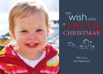
I dropped my photo onto the canvas, added a blue rectangle to the right and made some word art magic with some fonts from SNF. That's it! It was so easy!
ScrapNfonts has new holiday card font bundles called Trios. I used the Joyful Trio and SNF Daphne for the above card.
I'll walk you through this next one, which is only slightly more involved than the last--you'll see.
1. First I started with my canvas, 8" x 4" this time. I made the background green and added a long rectangle in a lighter green.
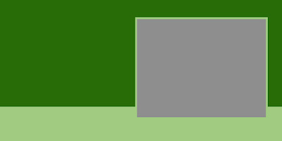
2. I made another rectangle, a gray one, where I wanted my photo to be. I gave it a matching light green stroke (an outline around the edge) for a frame using layer styles.
3. Next - probably one of the most important things to learn in Photoshop if you do a lot of cards or scrapbooks - I used a clipping mask to add my photo. I dropped my photo in the canvas, then made sure the photo was just above the layer with the gray box. In the layers window I right click on the photo layer (specifically the text of the layer, not the image), then in the menu that appears, click "Create Clipping Mask."
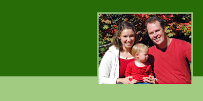
Voila! Nicely framed and everything.
4. Now it's time to make it fun. I decided to use the Merry and Bright Trio for this card, so I'll start with DB O Tannenbaum. Shuffling through the dozens of beautiful trees, I picked just three. Three is always a good number to make things look artistic.
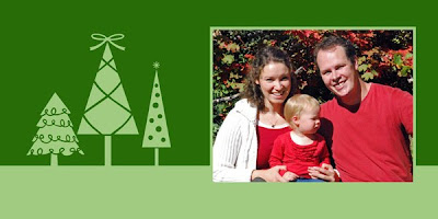
5. Now we could keep it like this, nice and simple, but I want a little more drama, so I'm going to add some swirls from DB Dainty Swirl. I use this font a lot for subtle details. For this I enlarged some of the images really big, layered them below the photo, and set the swirly layer's opacity to 20%.
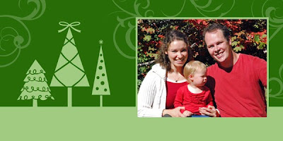
6. Since everything so far is green, I want to add a little color, just a little. it's easy to use the paint bucket tool on DoodleBats, you just have to rasterize the text first (right click on layer > Rasterize Type). That's how I made the bow at the top of the middle tree red. Then I added some circles and lines, a little offset so it looks kind of funky, for ornaments.
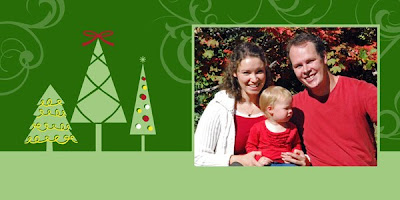
7. Finally, pick your words and plop them into the layout! Ta Da! A finished Christmas card.
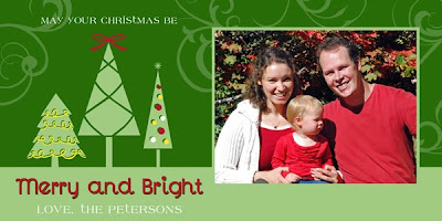
Be careful about the alignment of multiple rows of text. To make the design look more professional, try to keep them all aligned the same, either center or to one side. You can select multiple layers of text in the layers window, then in the top menu bar click Layer > Align > then pick your alignment.
Using this same simple layout I also made this card
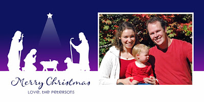
using the Nativity Trio, and this card
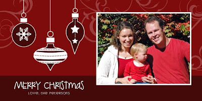
using DB Christmas Ornaments, LD Gregarious and LD Woodland.
If you are comfortable with clipping masks, layers and spacing, try making a geometric photo collage. They are totally hot right now. I made this one with the Holiday Birds Trio.
If you need more inspiration, I always get loads of ideas when I search google images with phrases like "Holiday Photo Cards".
Good luck! If you make your own Holiday cards this year using SNF product, I'd love to see them! Post them in the SNF Idea Gallery or your blog and let me know the link.
Happy Holiday Greetings!
Tuesday, November 30, 2010
Tuesday, October 19, 2010
Halloween Party Time!
We're having a party! Last year we covered the food, this year as the host of the party, I have to make sure my house is decorated for the occassion! Since I have little babes in the house I wasn't too eager for gory decorations, and I'm on a budget, so no expensive store-bought decorations. My challenge is set: make homemade decorations worthy of a smokin' Halloween party.
This first decoration was a no brainer. A Halloween banner was top on my list.
These banners are so easy to make. I used Amber Autumn Fall Paper to make the flags, lined them up with some ribbon and sewed across. You don't even need to sew, you can glue the paper on the ribbon. I glued the letters on the flags. I originally was going to put all the letters in circles so I'd only have to cut circles, but I was feeling ambitious. We'll call it a Halloween labor of love (cutting by hand). All the fonts I used are in the Hairy Scary Super Bundle. For specific fonts, look here.
I decided I needed another big decoration.
So I stole the biggest Christmas decoration and made it Halloween--on a budget. This was a branch in the yard waste pile in my backyard. Seriously. It works perfectly. I spray-painted it black, stuck it in a terra cotta pot I already had, and stabilized it with small rocks (again from my backyard). Then I made the ornaments.
I started by printing off a bunch of DoodleBat images I liked in 2" circles on yellow paper. If you want the specific DoodleBats I used, look here. I glued that onto black cardstock and cut out each circle. On the backside, I brushed glue and sprinkled glitter. *Smile* Sparkles make me happy.
If I have more time before my party, I'm absolutely making more ornaments. I think this project will look better and better with more ornaments.
Even though I'm not cooking awesome treats this year, I still want to decorate the food. Hello candy bowl gravestones.
Again, these are totally easy. I printed spooky names on spooky paper, folded the paper above the names and cut out gravestones on the fold. (Paper is from Basic Grey Green at Heart, fonts are LD Rococo, LD Potter and LD Blackbeard.) To stand them up, I folded little tabs at the bottom.
Easy. But it really spices up a candy bowl and sets the mood. I love it.
Lastly, we need some mood lighting inside (the jack-o-lanterns will be outside). Solution: spooky vellum paper lanterns.
You like? Here's how I made them. I started out by outlining a lantern pattern I made onto black paper. Unfortunately I couldn't quite fit all four sides on one 12"x12" paper, so I needed two papers. I don't worry about too many scraps--I'll just make more ornaments for my tree. Come on, it's Halloween. There's always something to make with black paper :)
Cut.
Fold.
I went back to the computer and made some "window" silhouettes to fit in the lantern windows. I used DB Fright Night. I love that DoodleBat. I printed my windows on vellum paper so the light would shine through.
Cut.
Tape. (I was in do-it-quick mode. Glue would work just as well. Maybe better.)
Finally I taped (but glue would be better) the lantern together and put a light inside. It turned out so nice! I wish you could see it in person, it's even better than the picture. And it's just paper! Talk about Halloween coolness on a budget.
If you would like to make a lantern like this, I will share my pattern with you! Click here for a zipped PDF file.
Let me know if you make any of these crafts. I'd love to hear how they turn out! If you use any scrapNfonts products, post your project in the idea gallery so everyone can see!
Happy Halloween Crafting!
Shop ScrapNfonts.com for the widest variety of craft and scrapbooking fonts, DoodleBats, WordArt and Brushes.
Monday, September 27, 2010
Thrifty Gifting: Jars of Fun
Question: What do you see when you look at this picture?
Answer: Potential! Imagine the possibilities! This jar is just itching to be filled with treats, whether they are for you or to give away. You know what else it's itching for? To be beautifully presented, and that's where I come in.
I have recently discovered the versatility of mason jars and am so excited! They are a fabulous, cost-effective way to create beautiful gifts for the holidays, favors, or just because. Of course, if you can your own jams, sauces or soups, those also can be beautified with a homemade label by you.
After filling my jar, I started with this:
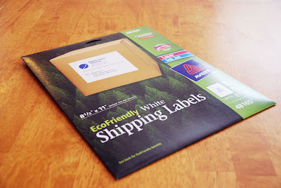
Full sheet sticker paper. They are camouflaged as "shipping labels" but don't let that fool you. They travel through my printer perfectly and I can squeeze at least four jars worth of labels per page if I puzzle them together.
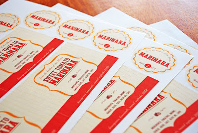
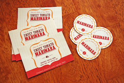
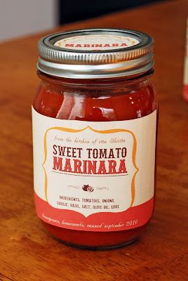
My treat of choice is homemade tomato sauce. Mmmmm. Just thinking about it makes my mouth water and fills me with a happy warm feeling of home comfort. I carefully cut out the printed labels.
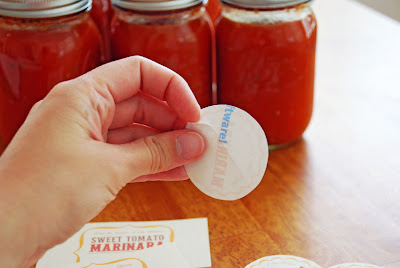
Then I peel the paper off the back of the sticker and carefully place them on my jars. Most of my stickers had a handy diagonal cut through the paper on the back of the stickers so it was pretty easy to get the stickers off. Some stickers needed a little coercion, but they came with a little help.
Here is my final shiny happy jar of tomato sauce. Isn't it lovely?
I created the label using LD Petticoat Black for the title, LD Antique for the script at the top and bottom of the label, and DB Cookout and DB Fleuries for the little tomato decoration. For the gold frame shape I actually used the letter L from DB Chill Out and erased the words in the middle.
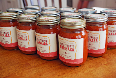
Here is my final army of tomato sauce jars. They look pretty impressive all together like that!
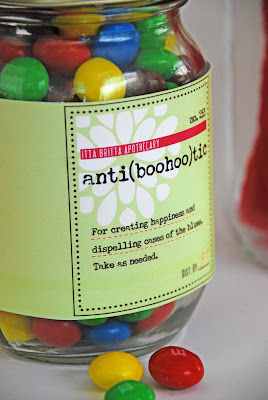
But don't think you have to make your own tomato sauce to make cute labels! Here is a jar of "medicine" to make someone feel better on a blue day. Just add candy! Easy, huh? But totally cute.
This label uses DB Floral Infusion for the white flower, LD Remington Portable for the main text on the label (I thought it gave it a nice old prescription bottle look) and SNF Uptown for some little details (i.e. itta britta apothecary).
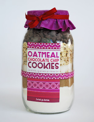
Have you ever seen those cookie recipes in a jar? They are so much fun to give and receive.
I got the recipe for these cookies here. I made this label using mostly DB Karma Borders - I L.O.V.E. this DoodleBat - and for the words I used SNF Duluth Block, SNF Party Script and Party Script Bold. I used the same fonts on the back where I included the directions to finish off the recipe.
Are you totally psyched to make a mason jar project now?
Yes?
Want some help starting out?
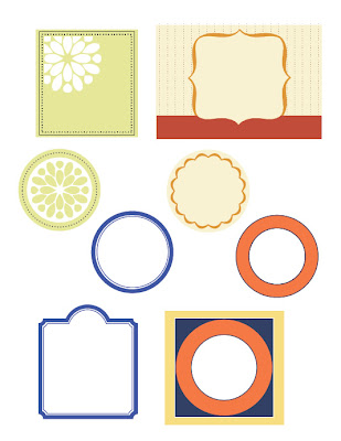
Good. I can offer help... it's a free download! Hurray! There are four labels on this pdf, including round labels for the lid. Pick your own fonts from scrapNfonts to complete the details. (You can click on the image to download the pdf.)
Happy canning! and labeling! and gift giving!
****UPDATE****
Since many of you requested some direction on how to add fonts to the labels I will add a few pointers here. First of all, if you are familiar with a graphic program that uses layers, such as Photoshop, Photoshop Elements, Fireworks, etc, that would be best. You can type on a different layer from the labels and move the type around, change the font, etc, until you get what you want.
If you do not have Photoshop, fear not! This is still a project you can do, you just have to be more patient. If you have Windows chances are you have "Paint." Open up the pdf in Paint and select the type tool (It looks like the letter A in a box). Once you start typing you must do all the editing you will want (font color, size, location, etc) on that particular type box before you do anything else. You can move the type box around while it's selected if you hover the cursor over the edges/corners. When you get an arrow with four heads, click and drag to move the box. The arrow with two heads will resize the type box. Once that type box isn't selected anymore, you can't change it. If you happen to de-select the type box and you don't like how it looks, just hit Ctrl+Z and it will undo whatever you most recently did. You can save and print from Paint, too. Good Luck!
Shop ScrapNfonts.com for the widest variety of craft and scrapbooking fonts, DoodleBats, WordArt and Brushes.
Wednesday, August 18, 2010
Photoshop DIY: 7 Steps to Sweet Digital Stickers
Stickers have always been an essential part of any scrapbooking arsenal. Sometimes an old-fashioned looking sticker with the white borders is just what I need to complete a layout. I have created a quick way that I like to make DoodleBats look like stickers with the help of Photoshop.
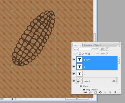
1. First, pick out a DoodleBat for your subject and pick out a color for the DoodleBat. I always start by duplicating the DoodleBat layer, so I have two of the same images exactly on top of each other. For my image I used letter Z from DB Food Fun. You may think it's corny (hee hee) but I love this DB.
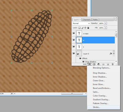
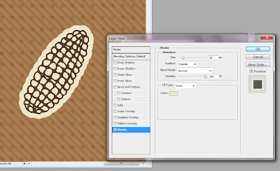
2. Next, select the bottom layer, go to the layer styles and add a “Stroke.”
This will automatically add a 3 pixel red line around every edge of your layer. A pop-up window will also appear so you can customize your stroke. I don’t want red so I changed the color to beige by clicking the color box and picking a new color. I also wanted my line to be thicker than 3 pixels so with the scale marked “size” I dragged the size up to 30 pixels. That’s just about right for a sticker border look. Click “OK.”
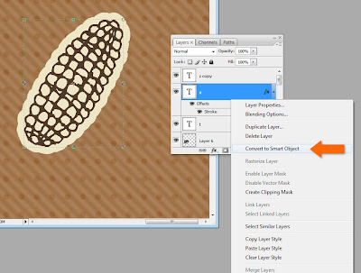
3. If you still have holes in the middle of the DoodleBat image, don’t fret, will color those in. First we have to right-click on the layer in the layer window* and click “Convert to Smart Object.” This will make the layer style (the stroke) part of the image.
*Note, when right-clicking on a layer make sure you click in the grey area next to the name of the layer. If you click on the little image icon of the layer you will get a different drop-down menu.
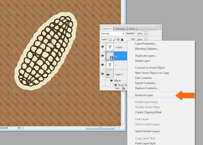
4. Then we have to right-click on the layer again and hit “Rasterize Layer.” This will allow us to be able to color on the layer.
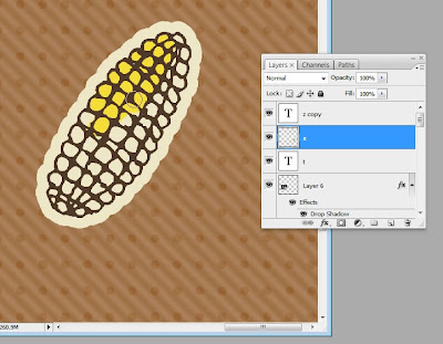
5. Next, go on and pick your brush tool, pick your color(s) and let out your inner child as you color. As long as you keep all your work on the bottom copy layer, the DoodleBat image will be uninterrupted on top.
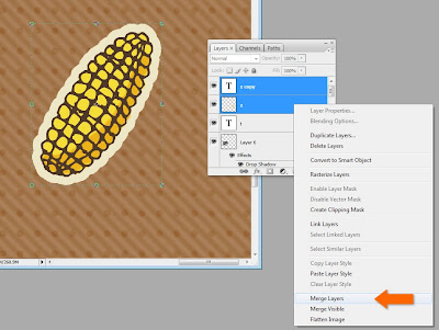
6. Once you’re done coloring, select both layers of the DoodleBat that you copied in the beginning. Right-click on the bottom layer* and select “Merge Layers.”
*Note, if you right-click on the top layer you will get a different drop-down menu related to fonts, since that layer is still a font layer.
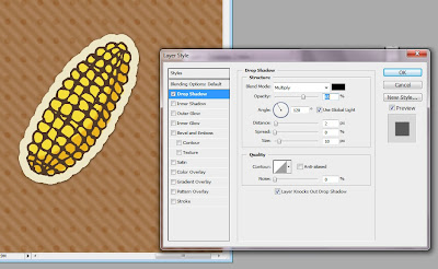
7. Now it’s time for the final touches. Select the layer again and go to layer styles. I always add a drop shadow. Sometimes I also add an inner glow (in the form of a linear burn) to make it look aged. You could also add texture or a bevel to make it bubble out.
The sky is the limit. There is always more than one way to skin a cat, and that is especially true when your toolbox is Photoshop. If you’re new to Photoshop or Photoshop Elements, play around, get yourself comfortable with one menu option at a time. Most of all, don’t get discouraged. There’s a lot of amazing stuff you can do.
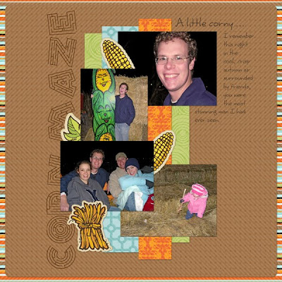
Here is the final layout I used my corny stickers for.
For the leaf and corn bundle stickers I used DB Fall Doodles. For the title font I used LD Maze, on clearance now for 50¢ (it was perfect for this layout). For the journaling font I used Scrap Happy, also on clearance now. The paper is from Lettering Delights 365 Days Paper Pack.
Friday, August 6, 2010
Weekend color inspiration
I got these flowers this past week and have been inspired! I probably wouldn't have put these colors together on my own, but now I can't wait to in a project of my own. The photo isn't a perfect representation, there is a deep red, bright yellow, gold and accents of warm purple.
This is my weekend project. I'll show you when it's done! If you have been inspired too, please share!
Labels:
inspiration
Friday, July 30, 2010
Crafting MacGyver: Circular Logic
I have a present for you...
Tempting, huh? Wanna see what's in it? Wanna learn how to make it? Read on!
First of all, I have a confession. I don't have a cutting machine, but I would love one. I drool over projects in the idea gallery by Regina Easter, who is amazing with personal cutting machines. As a result of this absence in my crafting life, I make due with things I have hanging around. My husband has called me the MacGyver of crafting because I resort to some weird, weird stuff.
Lately I've been really in to circles. A nice crisp clean circle is charming on a card, perfect for kids crafts and necessary for some fabric crafts. Where do I go for my circle tools galore? Why, the kitchen, of course!
Look at all those circles, just waiting to be used and outlined. I think one of my primary go-to circles is the lid of my peanut butter jar. That size circle works for dozens of projects! Of course, I first double check to make sure there's no peanut butter on the lid.
For today's occasion, I have printed out an image for a birthday card. The image is the letter "a" from DB Party Animals scaled up to around 200 point font size. After examining my toolbox, I discovered that the lid to my peanuts is perfect.
Next I need a slightly larger lid for a paper mat. A little more kitchen wandering, and there it is! It's the lid of my sugar canister. Perfect.
Gently outline with a pencil (keeping the pencil at a 45 degree angle all the way around the edge)....
carefully cut exactly on my drawn circle...
and voila! Two perfect circles.
And a little while later... a finished card! Yay! I found a nice font to compliment my image in Scrap Round.
But I'm not done with my circles yet. I need to make that cute little envelope wrapped up like a present to hide this darling little elephant. That means, back to my circle toolbox! I need to find a circle that is just slightly taller than the entire card.
There it is. Thank you, Mr. Quaker.
Trace and cut out four circles of the same size.
Fold each paper circle exactly in half. Fold crisply.
Arrange the folds together in a square, carefully overlapping each circle under and over the circles next to it.
Without too much moving around, squeeze a little glue under each overlap. Before the glue is dry, make sure to bring the circles tightly together in the middle, so there's no hole in the middle.
Here is your envelope. Gosh darn, this is so cute you could make this into the card itself! Just slap a pretty square piece of paper right in the middle with your message.
But not today, not for me. I have a charming, playful little elephant who wants a home. In he goes!
Carefully fold each flap down, tucking the last one in so each flap overlaps the one next to it.
Here is my completed envelope:
Now for the final fun touch! A ribbon wrapped around the whole kit-n-caboodle.
And there it is! There is your circular gift, just waiting to be given away. I promise it will bring a smile to the lucky recipient. Happy crafting!
If you like the hand-drawn image I used of the elephant with the party hat, you should hop and skip over to scrapNfonts and check out other hand drawn doodlebats. There are tons to choose from! I used paper from Cosmo Cricket's Lil Man collection.
Shop ScrapNfonts.com for the widest variety of craft and scrapbooking fonts, DoodleBats, WordArt and Brushes.
Subscribe to:
Posts (Atom)