Monday, June 13, 2011

Photo tip: Tell your story better with photos

We've all seen it, maybe even been guilty of it. We've looked through a scrapbook or a collection of photos and every photo is the same: a series of smiling faces looking at the camera. Each page looks like the next.

font: LD Fresh Air, lavender in background: DB Herb Garden

Although it's nice to see familiar faces, what stories do these photos tell? Do they remind us of the experiences we had? Is this the best way for us to capture our memories?

I don't think it is.

I remember visiting my sister one holiday and leafing through her photo album on the coffee table. I started as a casual observer, but quickly became engrossed as I feasted through a year of her life in pictures. Why was it so exciting to look through this book of mostly strangers and places I didn't know? I complimented her and her exciting life, and then she told me something that's stuck with me ever since. She said, the key to making photo albums interesting is to have a three-way balance of subject matter, typically 1/3 people, 1/3 locations and 1/3 things.

This seemed so simple! That's it? That's all you did to make your stories more exciting through photos? Yup. So let's dissect this a little.

1/3 People

Let's face it, photos of people are fun to look at. Especially children! However, taking photos of smiling faces over and over again doesn't tell a very good story. Yes, a few smiling faces here and there are good, but also take some candid shots, some action shots, and some goofy shots. It's also totally fine to mix categories. Want a view of Mt. Rushmore with your kids in front of it? Ta da! You've covered two categories of subject matter with one photo.

1/3 Locations

This is definitely the category I forget about most, but gosh it makes a big difference in setting the story. Such little things like a shot of the back-yard, an overview of the farmers market, the gorgeous nature view on your hike, or that historic building you visited set the stage and help you tell (and remember) the whole story.

I especially like the impact of different weather and time of day. A photo of a hill with fresh snow before the kids sled down it, what an exciting prospect it was! The sun setting on the lake shore where you had a campout, remember the relaxing peace. You get the picture... or at least I hope you will.

1/3 Things

This category can be really fun and tell so much about your interests. In my personal life narrative, food is oh, so important. Close up shots of what I make or eat are a fun part of my memory books. Some other ideas include cars, toys, animals, flowers... the list can go on and on. Just think of what you're doing, what interests you, what tells your story and even the most mundane objects can become exciting chapters in your photo album. In my father's photo album, he has pictures of furniture when my parents were first married. Now, 40 years later, it's so fun to see the colors and decor they had so early in their life together!

Taking this balance into mind, I made a two-page spread of an outing with my daughter. There are six photos total, but I tried to balance the above categories in them.

font: LD Fresh Air, lavender in background: DB Herb Garden

It's really exciting to see the story told almost exclusively in pictures! Of course, a little journaling always is nice.

What do you think? Do you have favorite ways to tell your stories?

Frame used in subtitle images is from Film Frame Brushes.

Shop ScrapNfonts.com for the widest variety of craft and scrapbooking fonts, DoodleBats, WordArt and Brushes.

Tuesday, March 15, 2011

Lucky Day! T-shirts made easy

I have a new obsession. I can't stop myself from making t-shirts with iron-on transfers.

What sparked this obsession you may wonder? It was the discovery of iron-on transfer paper that I can print out from my own printer!

If you haven't used this, you may be as skeptical as I was when I first saw it. Psh, that won't last through one wash! It will peel and crack and look TACKY. That's what I used to think. I'm here to tell you if you do it right, it will last and can look awesome.

My first shirt was for my husband who wanted a shirt to honor his favorite basketball player. He wears it all. the. time. We've washed it over and over and it still looks great (and feels softer with each wash).

Making a shirt

I decided I wanted St. Patrick's Day shirts that we could wear past St. Patrick's Day, too. That is where this tutorial begins. Enter SNF Jolly Curls, SNF Sophia and DB Lucky Trinket in fun, lucky designs.

First rule: before you print your design onto the transfer paper, make it a mirror image because you will be ironing it face down. Most design programs will let you do this or your printer may have a reverse or mirror image setting.

Next, cut out your image with a narrow margin around it. Try to keep corners rounded.

Here is when the nit-picky details make a difference. First, drain all the water from your iron and let it heat up for 5 minutes to evaporate any moisture. Don't take out your ironing boards. These transfers need a hard flat surface that can trap the heat between the iron and the surface. The instructions recommend veneer or laminate countertops covered by a pillowcase. I can do that.

Iron the pillowcase and your shirt (or fabric if your not doing a shirt) to make sure they are flat and free from moisture.

Then place your image face down how you want it on your fabric.

Push hard on your iron, with two hands, and slowly move the iron back and forth, up and down over your paper. Pay close attention to the edges. Make sure they get lots of heat and pressure. It should take 1-2 full minutes of slow pressured ironing to make sure you've got it.

Let your shirt cool for about two minutes and then carefully peel back the paper and reveal your creation! This is the exciting part.

Woo Hoo! It worked! (I haven't had it fail on me yet, but it's still exciting every time it works.)

I'm pretty pleased with my two St. Patty's shirts. If you like these designs, you can find slightly scaled down versions in this collection of Lucky Word Art at SNF.

Just so you know I'm not just making this obsession up, here is a sampling of some of the shirts I've made in the past few months.

I've burned through at least two packages of transfer paper. Good luck, and beware. It's funner to make these than you may think, and oh so easy.

Shop ScrapNfonts.com for the widest variety of craft and scrapbooking fonts, DoodleBats, WordArt and Brushes.

Tuesday, January 25, 2011

Use your fonts Awesomely

Valentine's Day is less than three weeks away. More than any other holiday, Valentine's day is the holiday of words. It's time to express your affection in notes, cards, or spoken word. This year let ScrapNfonts fonts do some of the talking! Here are three creative ways to spread those words of love in stunning cards:

1. For the Love of Fonts: use a lot of fonts in short words or phrases.

For this card I found how to spell "love" in a bunch of languages. You could also use adjectives to describe your loved one in a card like this.

I picked a different font for each language (SNF has a lot of fonts with international characters, all the Premium Fonts and many Standard Fonts), and puzzled them together on a card. I liked how it looked with boxes around each word, but it can be done collage style, too, without the boxes. If you have certain words that are more important than others, make them larger (like I did with "LOVE"). Tip: to fill in holes, add DoodleBats.

To see all the fonts I used in this card, go here.


2. Take fonts to the heart: Type your fonts within a shape or larger letters with the help of Photoshop.

Last Spring, Brian Tippetts gave us another example of this fun way to use fonts, and he included two free Photoshop template downloads to help you.

If you're using Photoshop, it's not hard to create this look on your own! I use Photoshop CS3, but the method is the same for a lot of versions of Photoshop.

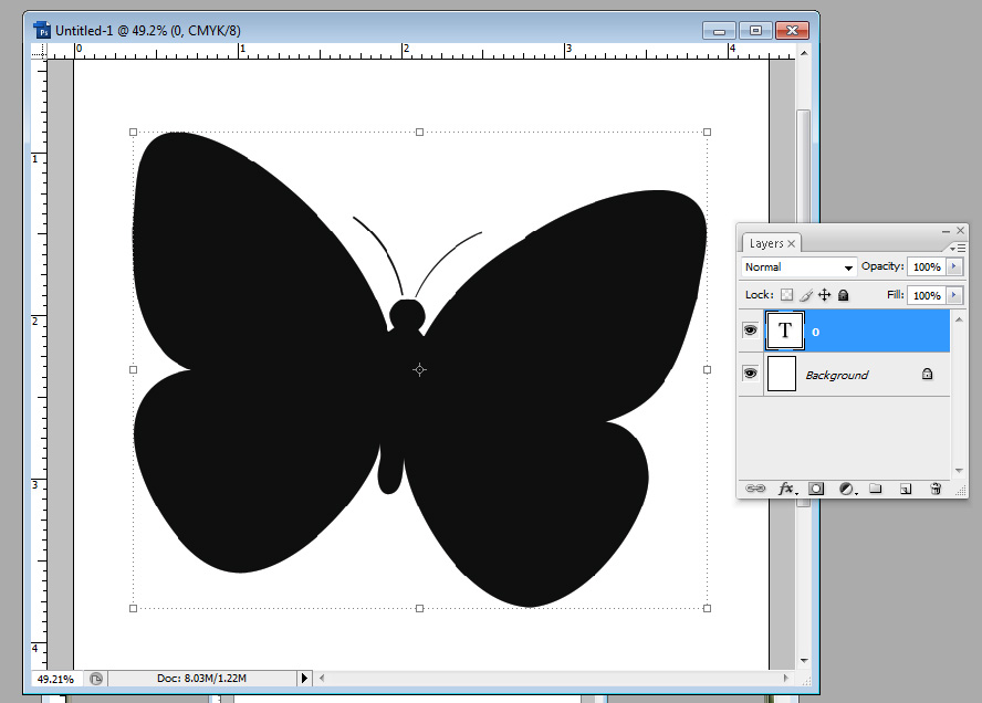
First, Type the letters or DoodleBat you want. Pick a thick, simple font (like LD Mon Cherie or LD Modern Slab), or a solid simple DoodleBat image, and scale it BIG. I used the number 0 in DB Sweet Spring for the butterfly below.

Notice the layers window shows my butterfly as a text layer. For the next step, while your text layer is selected, go to the top menu bar for Layer > Type > Convert to Shape. When you click that, your layers window will look like this:

And your DoodleBat/letter will have a line around it, meaning it's selected and it's changed into a shape.

If your shape does not have a line around it, look at your layers window. The layer with the shape should have two parts, the first is a colored square and the second is a square with your shape in it. There is a little chain link between the two.

The shape square should have a double line around it. If it does, you're good for the next step. If it doesn't, click the shape square once and that should select the shape. It is important for the shape to be selected for the next step.

Next we select our type tool. Hover the cursor over your selected shape and the cursor should look different. It should have a dotted circle around it.

Make sure not to hover the cursor on the edge of the shape or you'll get a different cursor with a diagonal line through it. This cursor will allow you to type on the outside edge of your shape, which is a good tool, but not what we're trying to do here. Here are the two different cursors.

We want the cursor pictured on the left. Click the mouse when you see this cursor, and you can start typing in your shape. Make sure to make your font size smaller and use a font that looks good inside your shape. You may have to play with font size and paragraph alignment to get a look you like. For this card, I used LD Jambalaya.

Notice you now have a shape layer and a text layer. If you want to make your shape layer invisible, just click on the little eye next to the layer in the Layers window. The text layer will still type in your shape.

Finally, fit it into your layout, and you're done! Easier than you thought, eh? And totally cool.


3. Build a foundation of Love: Use blocks of text as a background element.

My husband and I have always loved the song "I Will" by the Beatles. By layering the words to that song subtly in the background of this card using LD Abe Lincoln, it introduces another layer of sentiment. The bird is from DB Sweet Spring and the brown font is LD Remington Portable.

This example uses a block of text as the ground layer for the eskimos. It's not the primary focus, but another fun way to add text and sentiment. The text is LD Advertise This and the eskimos are from DB Eskimo Kisses.

I hope you can use these ideas to make awesome Valentine's Day cards and future projects! Happy Fonting!

Shop ScrapNfonts.com for the widest variety of craft and scrapbooking fonts, DoodleBats, WordArt and Brushes.

Tuesday, November 30, 2010

Photoshop DIY: Christmas cards easy as pie

Photo cards have become a sweet and lovely tradition in the seasonal card exchange, and they are really easy to make in Photoshop or Photoshop elements. Really easy.

Start by selecting a size that is common for cards, so you won't have any problems printing at a print shop or mailing. The two dimensions I'm using in this post are 5" x 7" and 8" x 4". Here is a 7" x 5":

I dropped my photo onto the canvas, added a blue rectangle to the right and made some word art magic with some fonts from SNF. That's it! It was so easy!

ScrapNfonts has new holiday card font bundles called Trios. I used the Joyful Trio and SNF Daphne for the above card.

I'll walk you through this next one, which is only slightly more involved than the last--you'll see.

1. First I started with my canvas, 8" x 4" this time. I made the background green and added a long rectangle in a lighter green.

2. I made another rectangle, a gray one, where I wanted my photo to be. I gave it a matching light green stroke (an outline around the edge) for a frame using layer styles.

3. Next - probably one of the most important things to learn in Photoshop if you do a lot of cards or scrapbooks - I used a clipping mask to add my photo. I dropped my photo in the canvas, then made sure the photo was just above the layer with the gray box. In the layers window I right click on the photo layer (specifically the text of the layer, not the image), then in the menu that appears, click "Create Clipping Mask."

Voila! Nicely framed and everything.

4. Now it's time to make it fun. I decided to use the Merry and Bright Trio for this card, so I'll start with DB O Tannenbaum. Shuffling through the dozens of beautiful trees, I picked just three. Three is always a good number to make things look artistic.

5. Now we could keep it like this, nice and simple, but I want a little more drama, so I'm going to add some swirls from DB Dainty Swirl. I use this font a lot for subtle details. For this I enlarged some of the images really big, layered them below the photo, and set the swirly layer's opacity to 20%.

6. Since everything so far is green, I want to add a little color, just a little. it's easy to use the paint bucket tool on DoodleBats, you just have to rasterize the text first (right click on layer > Rasterize Type). That's how I made the bow at the top of the middle tree red. Then I added some circles and lines, a little offset so it looks kind of funky, for ornaments.

7. Finally, pick your words and plop them into the layout! Ta Da! A finished Christmas card.

Be careful about the alignment of multiple rows of text. To make the design look more professional, try to keep them all aligned the same, either center or to one side. You can select multiple layers of text in the layers window, then in the top menu bar click Layer > Align > then pick your alignment.

Using this same simple layout I also made this card

using the Nativity Trio, and this card

using DB Christmas Ornaments, LD Gregarious and LD Woodland.

If you are comfortable with clipping masks, layers and spacing, try making a geometric photo collage. They are totally hot right now. I made this one with the Holiday Birds Trio.

If you need more inspiration, I always get loads of ideas when I search google images with phrases like "Holiday Photo Cards".

Good luck! If you make your own Holiday cards this year using SNF product, I'd love to see them! Post them in the SNF Idea Gallery or your blog and let me know the link.

Happy Holiday Greetings!

Tuesday, October 19, 2010

Halloween Party Time!

We're having a party! Last year we covered the food, this year as the host of the party, I have to make sure my house is decorated for the occassion! Since I have little babes in the house I wasn't too eager for gory decorations, and I'm on a budget, so no expensive store-bought decorations. My challenge is set: make homemade decorations worthy of a smokin' Halloween party.

This first decoration was a no brainer. A Halloween banner was top on my list.

These banners are so easy to make. I used Amber Autumn Fall Paper to make the flags, lined them up with some ribbon and sewed across. You don't even need to sew, you can glue the paper on the ribbon. I glued the letters on the flags. I originally was going to put all the letters in circles so I'd only have to cut circles, but I was feeling ambitious. We'll call it a Halloween labor of love (cutting by hand). All the fonts I used are in the Hairy Scary Super Bundle. For specific fonts, look here.

I decided I needed another big decoration.

So I stole the biggest Christmas decoration and made it Halloween--on a budget. This was a branch in the yard waste pile in my backyard. Seriously. It works perfectly. I spray-painted it black, stuck it in a terra cotta pot I already had, and stabilized it with small rocks (again from my backyard). Then I made the ornaments.

I started by printing off a bunch of DoodleBat images I liked in 2" circles on yellow paper. If you want the specific DoodleBats I used, look here. I glued that onto black cardstock and cut out each circle. On the backside, I brushed glue and sprinkled glitter. *Smile* Sparkles make me happy.

If I have more time before my party, I'm absolutely making more ornaments. I think this project will look better and better with more ornaments.

Even though I'm not cooking awesome treats this year, I still want to decorate the food. Hello candy bowl gravestones.

Again, these are totally easy. I printed spooky names on spooky paper, folded the paper above the names and cut out gravestones on the fold. (Paper is from Basic Grey Green at Heart, fonts are LD Rococo, LD Potter and LD Blackbeard.) To stand them up, I folded little tabs at the bottom.

Easy. But it really spices up a candy bowl and sets the mood. I love it.

Lastly, we need some mood lighting inside (the jack-o-lanterns will be outside). Solution: spooky vellum paper lanterns.

You like? Here's how I made them. I started out by outlining a lantern pattern I made onto black paper. Unfortunately I couldn't quite fit all four sides on one 12"x12" paper, so I needed two papers. I don't worry about too many scraps--I'll just make more ornaments for my tree. Come on, it's Halloween. There's always something to make with black paper :)

Cut.

Fold.

I went back to the computer and made some "window" silhouettes to fit in the lantern windows. I used DB Fright Night. I love that DoodleBat. I printed my windows on vellum paper so the light would shine through.

Cut.

Tape. (I was in do-it-quick mode. Glue would work just as well. Maybe better.)

Finally I taped (but glue would be better) the lantern together and put a light inside. It turned out so nice! I wish you could see it in person, it's even better than the picture. And it's just paper! Talk about Halloween coolness on a budget.

If you would like to make a lantern like this, I will share my pattern with you! Click here for a zipped PDF file.

Let me know if you make any of these crafts. I'd love to hear how they turn out! If you use any scrapNfonts products, post your project in the idea gallery so everyone can see!

Happy Halloween Crafting!

Shop ScrapNfonts.com for the widest variety of craft and scrapbooking fonts, DoodleBats, WordArt and Brushes.